How to Apply Color Theory to Create Killer Instagram Feeds
How to use color theory on Instagram. Tips to create a killer feed, create your color palette, and revamp your aesthetic.

Fab Giovanetti
Entrepreneur
Color theory is the study of how colors work together to evoke emotion. This can be done through visual assets that help establish a brand’s personality and tone of voice. It's applied by brand owners, social media managers, and designers to create palettes and combinations for specific projects and brands.
You can tell so much from a first impression. The Instagram grid, in some respects, can be compared to an online window shop for a lot of brands. Consumers trust brands with a consistent look, or brand aesthetic. It helps increase brand awareness for your business and stand out in a crowded space. Indeed, it looks like first impressions do count. And, as Lucidpress reports, "71% of companies list customer confusion as the biggest negative impact of an inconsistent brand."
Using color theory on Instagram
Using color theory can be a powerful asset for planning your Instagram feed. By understanding how colors make people feel, you can curate your Instagram feed and stories highlights to reflect your brand aesthetic.
Color combinations can be an easy and fast way to communicate a message or theme.
As the attention span of your followers decreases, a well-thought out color palette can help you stand out from the crowd.
The first thing you have to do is figure out your Instagram aesthetic. The aesthetic stems from your brand identity. It will inform the choice of pictures you use and should be related to your tone of voice and how you want your audience to perceive your brand.
When choosing a color palette, bear in mind that less is more. Far too often brands will choose six or seven colors, which can make the feed feel scattered and inconsistent.
Here are some examples of different Instagram aesthetics:
Bright and bold. It's bright and playful and aimed at standing out by choosing bold shades
Muted and neutral. soothe your audience while giving a more comprehensive range of options when it comes to colors and combinations
Minimal with an accent. minimal aesthetics with a pop of color appeal to a broader audience while giving you more flexibility
Your Instagram aesthetic reflects your brand's personality, and it will echo through the colors you choose. For example, if your tone of voice is vibrant and fun, you may want a color palette that is bright and colorful.
If you are looking to evoke professionalism and authority, a minimal black and white look with one accent color may be the way to go.
Creating your Instagram color palette
First and foremost, start with the colors you already have in your brand. This may be established by a brand book. If you’re doing social media as part of any organization, they most likely have some kind of brand guideline, if not a formal book.
But what if you’re a single influencer or artist? Where do you start? Well, we have some tips for creating a color palette.
First, make sure you identify a lead color you want to be associated with your brand. Not only will this help with building a palette, but it will also reiterate the message you want to share across your feed.
Remember, each color will be associated with specific emotions or qualities. Some of these may vary depending on cultural influences. But, in general, people have similar responses to color:
Green for nature, health, and security.
Red for passion, health, boldness.
Yellow for playfulness, joy, wealth, and energy.
Brown for reliability, earth, grounding.
Blue for harmony, serenity, and peace.
Not sure where to start when choosing your Instagram lead color? Pick a color that fits the content you frequently post, or look at your logo and website.
Once you identify your lead color, you can build a palette that best represents your brand aesthetic and brand identity.
Understanding Color
Before we get into how to pick colors for your palette, let’s briefly cover some color basics. There are three categories of colors.
Primary colors: these are the R, G, and B in an RGB palette. Red, Green, and Blue. There’s also a Red, Yellow, Blue color wheel (RYB), but we’ll focus on RGB.
Secondary colors: these are colors created by combining two primary colors. In an RGB color wheel, they include cyan, magenta, yellow.
Tertiary colors: these are colors created by combining a primary color with a secondary one. On an RGB color wheel, tertiary colors include orange, chartreuse green, spring green, azure, violet and rose.
All told, there are twelve colors on the RGB color wheel. Now let’s look at how you can combine these colors.
Using a color wheel
When choosing a color palette for your feed, it can be helpful to get back to the color wheel for inspiration.

When you move up and down the color scale, you build palettes to pull new color shades and tints by choosing colors closer together or on the opposite scale. (You can create a color wheel on Adobe’s site.)
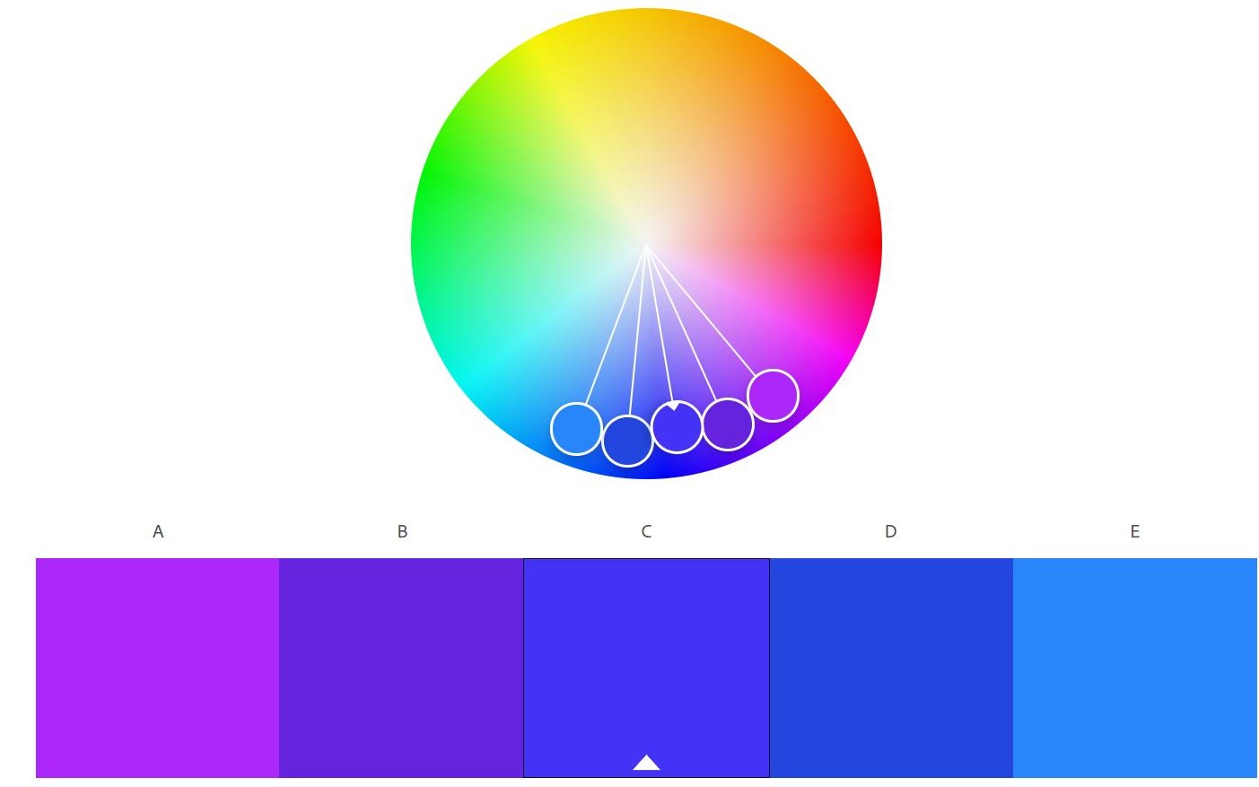
Monochromatic palette
A popular palette option many users rely on at first is monochromatic. Using only colors from the same family gives you a variety of shades on a given palette.
For example, mixing various shades of blue or green will create a monochromatic effect.
The trick to monochromatic palettes is to keep your tones close together, so they all blend seamlessly, banking on color harmony over bold clashes.
This palette can work for more muted and simple brand identities over colorful and playful ones. Here are a few of the most common.
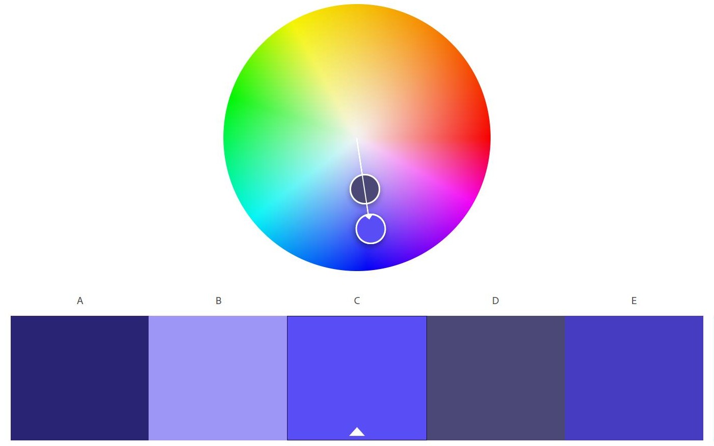
Complementary palette
Complementary color palettes use colors opposite each other on the color wheel. Begin with a primary color, then find the complete opposite color. This scheme is perfect for bold and bright brands looking to pop and be more creative with their feeds.
Analogous palette
Another option that draws upon color harmony is an analogous palette, which works with colors close together in the wheel.
Choose two colors that touch a different side of your primary color. You are most likely going to swing between two primary colors (for example, blue and green, or red and yellow), allowing you a combination of a few shades.
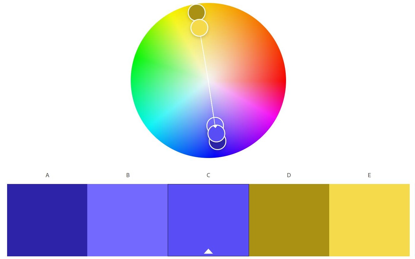
Triad palette
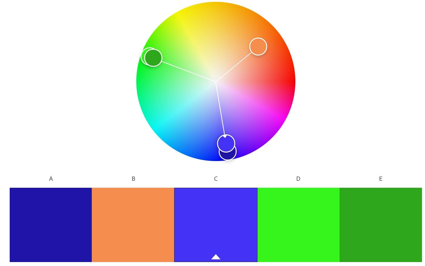
If you are struggling to choose one color for your base, you can dare to go for a triad palette. This method uses any three shades of equal distance from one another on the color wheel. It offers more contrast than complementary. It can be pretty effective, as long as the colors work well together and tap into popular aesthetics such as bold 90s or retro 70s looks.
Other palettes
There are other color palette combinations you can use (e.g.
Apply a palette to your brand
Once you have chosen your color palette, spend some time experimenting by mocking up a feed idea based on your choices. Seeing a grid example on your phone will help you get feedback on the aesthetic and make sure the colors you chose reflect your overall brand identity and tone.
A few apps to look at include Colordot (also available on iOS) and Palette (Android).
When you get clear on your palette, make sure you go over your overall content strategy and review the following:
Your current photo filters and how they work with your palette
Stock photos and whether they reflect your color choices
Graphics and templates to make sure they are in line with the palette
There is ultimately no right or wrong way to use color theory, but be deliberate and consistent. Remember, brands with a consistent looking visual story increase trust in their company and foster brand awareness, making them stand out in a crowded space.
+++++
Looking to create your own killer feed? UNUM is your best tool for planning, creating, and executing beautiful social media feeds and stories. Signup today for a free account.
~~~~~
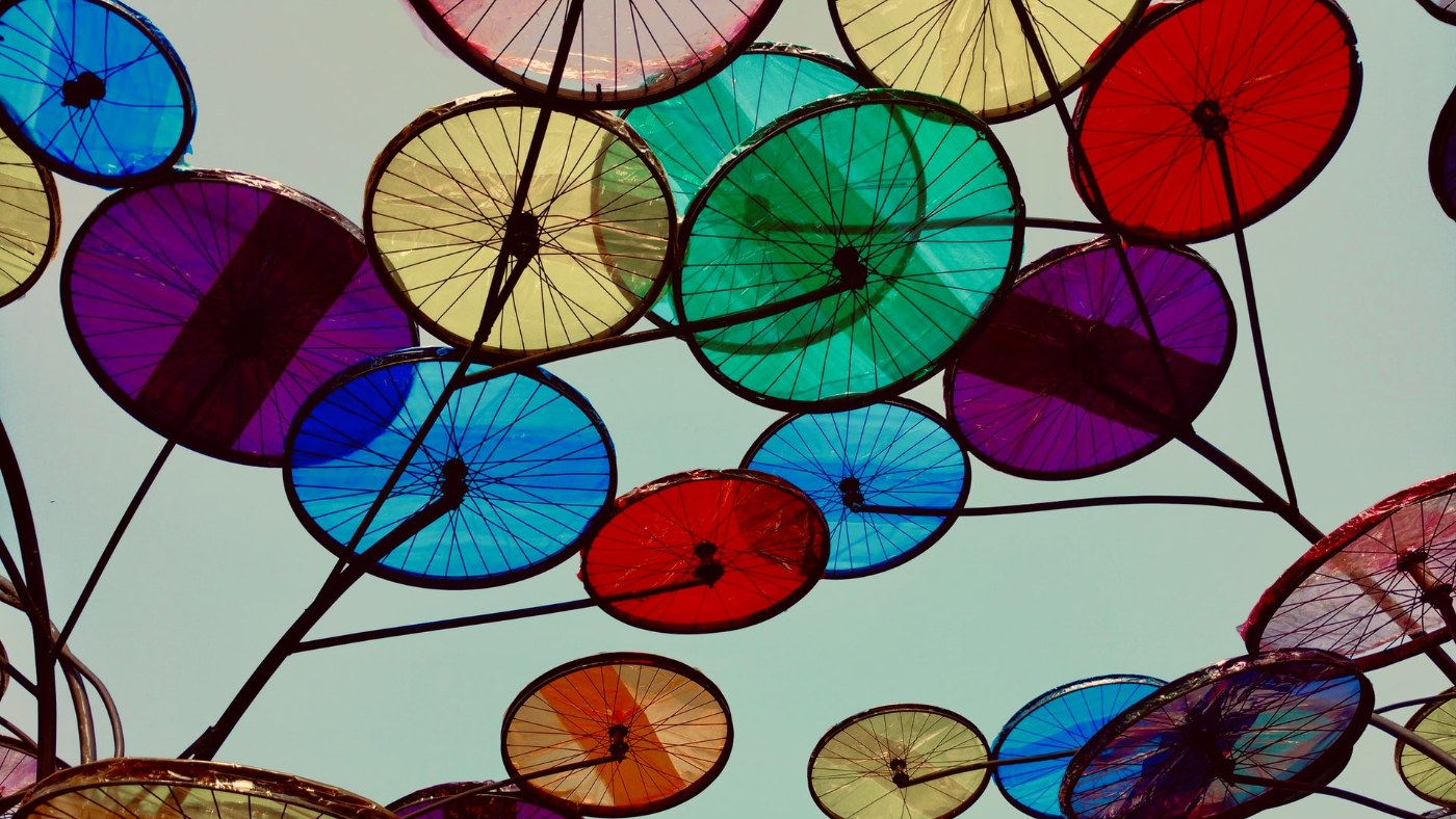
[Header image by Divyangi K on Unsplash]
Read more


Join our Newsletter
Sign up to our newsletter for all things marketing.